Agentic UI System

Year
'26
Tools
Figma (Variables, Components), Figma MCP, Claude
Role
Product Designer
An AI copilot for a small crystal store needed to show what it knows, what it’s doing, and what it’s about to change, so I designed a 79-variant Figma system for agentic interfaces on top of the store’s own design system.
The Problem & the Brief

AI agents don't just answer questions. They act. They call tools you can't see, spend money, email customers and change records, and when they're wrong they sound exactly as sure as when they're right.
Most AI interfaces hide all of that behind one confident tone, one spinner and one "nothing found" screen. I wanted to design the moments where that does the most damage: before an action, after one, while the agent is working, and when it isn't sure.
The setting
I built it around Sanatan Riddhi, the crystal bracelet store I designed and built on Shopify. The agent is an operations copilot for the owner. It checks stock, suggests restocks before festival season, drafts supplier orders and runs bulk catalogue changes.
My role
I designed the token architecture, every component and every state. I also wrote the usage rules and ran the accessibility audit.
Constraints
The brand came first. Every component had to sit inside Sanatan Riddhi's existing colours, type and spacing, without changing them.
Ops-side only. I kept the agent off the shopper side on purpose. A "high confidence" badge next to a claim like "supports prosperity" would misuse the very pattern this system exists to get right. On the ops side, confidence is about data.
A new store has little history. With a few weeks of sales, low confidence is the honest default for most suggestions, so the system had to make uncertainty normal, not alarming.
Illustrative data. Every figure in the components is realistic but invented.

Design System
Three layers, then components
Components never touch raw brand values. That way the agent layer can change, or the brand can be swapped, without either breaking the other.
Layer | What it holds |
|---|---|
Brand | 21 colours, 3 radii and 7 spacing steps, copied from the Sanatan Riddhi system |
Agentic Primitives | 6 hidden colours the brand didn't have: sage, ochre, plum, a red tint and a warm stone |
Agentic | 30 semantic tokens that describe meaning, not colour, such as |
Components | 18 components with 79 variants, taking colour only from the Agentic layer |
Five rules the system holds to
Red means a call failed. Nothing else uses it: not low confidence, not high-impact actions, not the undo countdown.
Never colour alone. Every state also changes shape, label or wording.
People's edits look different from the agent's. A value a person changes is marked, and the agent can't silently overwrite it later.
Every pair is checked. Text clears 4.5:1. Icons, input edges and the focus ring clear 3:1.
Components only speak Agentic. Nothing reaches past the semantic layer.
Type
I used 7 Manrope styles sized for dense working UI. The brand's 16px body and Cormorant headings stay on the storefront.

Key Components
Tool steps
When an agent queries a database, silence reads as a hang, and "thinking…" doesn't tell anyone which step broke.
Each step has a plain-words line ("Checking Shopify inventory") and the actual tool and outcome ("inventory-lookup · 42 SKUs · 1.2s").
The five statuses (Pending, Running, Done, Failed and Skipped) each have a different shape.
One rule: every step must end. A spinner still running after the answer appears is a bug.

Empty, error and low confidence
All three look like "nothing useful happened," but they ask for opposite responses:
Empty: the check worked and found nothing, so there's nothing to do.
Error: the check failed, so retry and don't act.
Low confidence: the check worked but the data is thin, so act carefully.
Each panel includes the tool step that produced it, so only Error shows a failed call. You can't mix them up, even in greyscale.

Confidence
The badge is the least important part. Two lines underneath do the work: why the agent is unsure ("Only 4 orders so far, all in the last 10 days") and what the number rests on.
Low confidence still shows the number, because hiding it makes people guess instead of check.
An Unknown tier covers the cases where the agent can't rate itself, so it never shows a made-up "medium."

Approval, undo and override
Not every action needs a confirmation. The design question is which control fits how reversible the action is.
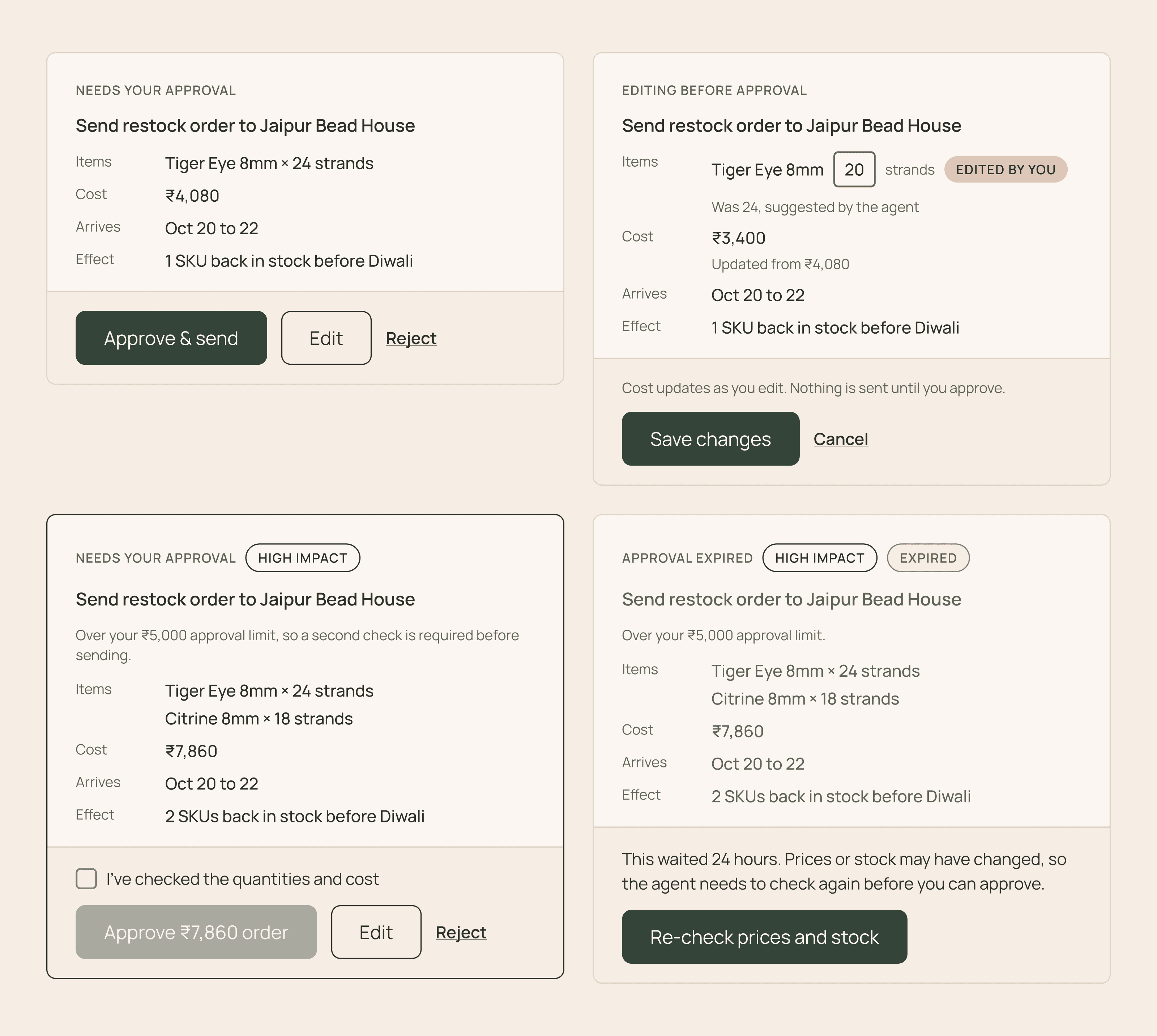
Approval, before an action: for anything costly that can't be undone.
The card shows the effect in the units the owner decides in: items, ₹ cost, arrival date, and what it changes.
Editing a quantity recalculates the cost and marks it "Edited by you."
Above a ₹5,000 limit, Approve stays disabled until a checkbox is ticked.
An approval that waits 24 hours expires and needs a fresh price check.
Undo, after an action: for things that are quick and cheap to reverse.
The copy says "Emailing 38 waitlisted people in 6s," not "Sent."
Override, in place: when the agent is close but wrong.
The owner's number is marked as hers.
The agent won't overwrite it on a later turn.

Run control
Long runs, like retagging 40 products, are where agent interfaces usually go vague.
Progress is shown in items, along with the tool and the item currently being worked on.
After a stop, the card says exactly what changed: "18 products have new tags; the other 22 are exactly as they were." It also offers Review and Undo for the part already done.

Input, streaming and memory
Prompt input: Text, Guided and Voice modes. A "Using" row shows which remembered facts the request will rely on. Voice transcripts are always editable before sending.
Streaming response: a partial answer is always labelled incomplete.
Reasoning accordion: written as factors and values, with a doubtful one still flagged "Check this" when collapsed.
Context chips: removable one at a time. Dashed means the agent inferred it, and filled means the owner set it.

Behind the Build
Workflow
I started with an HTML prototype of nine patterns to find out which ones were worth building properly. Then I moved to Figma to build them as a real system: variables first, then building blocks (tags, the checkbox, status indicators), then the larger components composed from those.
AI-assisted tooling
I worked with Claude through the Figma MCP, which let it build components in the file from my specs and decisions. I set the rules and states, and reviewed every component from a screenshot before moving on. Several of the hard problems below came out of those reviews.
Designing agent UI while directing an agent was useful in itself. The moments where I wanted to see a step, check a value or override a choice were the same moments this system is designed for.

Hard Problems
1. Low confidence looked like an error
Problem: My first low-confidence colour was clay. Next to the error panel, its "Limited data" tag was nearly the same pink as "Failed."
Fix: I moved low confidence to plum (the brand's Mood tint) and made "red means failure only" the first rule of the system.
Lesson: A colour can pass contrast and still fail meaning. Check states side by side, not one at a time.

2. The brand failed contrast once it carried agent UI
Problem: Three brand values that worked on the storefront fell short in dense interactive UI. The input border was 1.8:1, the Pending ring 1.8:1 and the gold focus ring 2.6:1, all under the 3:1 minimum.
Fix: I added a warm stone colour (3.5:1) for edges and the Pending ring, and pointed the focus ring at the brand's darker gold (4.8:1). All three fixes happened in the Agentic layer, and the brand itself stayed untouched.
Lesson: That's exactly what the layering is for. You fix meaning in the semantic layer, not by editing someone else's brand.
3. An undo that lies
Problem: My prototype said "Purchase order sent" next to an Undo button. If it's really sent, you can't recall it from the supplier.
Fix: The Undo Window describes what's about to happen ("Emailing 38 waitlisted people in 6s"). The Finalized state says plainly that it can't be recalled.
Lesson: In agent UI, the copy is part of the safety mechanism. A wrong verb is a broken promise.

4. A green check next to "Check this"
Problem: In the reasoning accordion, the doubtful factor still showed the green Done mark, which sent two signals at once.
Fix: Flagged factors now get their own plum caution marker, matching the "Check this" tag.
Lesson: "Finished" and "trustworthy" are different states, and the UI has to keep them apart.
Outcome
Token layers | 3 (Brand, Agentic Primitives, Agentic) |
Semantic tokens | 30, plus 6 hidden primitives |
Components | 18 components, 79 variants |
Accessibility | Every text pair at 4.5:1 or more; 5 failing pairs found and fixed |
Status | Complete in Figma; not yet tested with the store owner |
What's next
I want to test the approval and override flows with the store owner. In particular, I want to see whether the high-impact checkbox becomes a reflexive tick, and whether "Edited by you" makes the lock on her numbers feel trustworthy or rigid. After that come a compact button size, motion specs for the running arc and streaming cursor, and a dark mode for the Agentic layer.
Challenge
AI agents act on people’s behalf, often out of sight. When they’re wrong, they sound as sure as when they’re right. Most interfaces hide this behind one tone, one spinner and one empty screen, which leaves people unable to tell a failed call from a real answer, or a draft from a sent order.
Solution
I designed a Figma system for agentic UI on top of the Sanatan Riddhi design system: 3 token layers, 30 semantic tokens and 18 components. Five rules hold it together, starting with “red means a call failed.” Every state shows what the agent knows, what it did, and what a person can still change.
Sanatan Riddhi
HARDANI™